

Screen sizes are growing smaller and demand of these devices is growing very luxuriantly. With increased demand there comes a lot of competition in capturing the market. In this zest to capture the market all the mobile app developers try to come up with something new.
The main fight is to provide optimum user experience in a limited screen area. Though, providing a panoramic view kind of look by a mobile app is certainly a difficult task but now mobile app developers keep the design interface simple try to provide high end functionalities which is completely different from a desktop experience.
In short, the Mobile design trends of 2015 were primarily centered in delivering more and more features while keeping the design as simple as possible. Let’s see how these apps managed to get undivided attention of the users.
1. Layered Interface Design
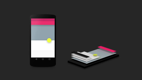
As we know that mobile screens are not that big which can give you a panoramic view kind of look like your website. However, these designs focus on simplicity but in order to deliver all the services offered you need to manage the space adeptly. This gave rise to Layered design interfaces. Thus, in order to do this your widgets should be active in the front and passive at the back.
2. Design a Flat Interface
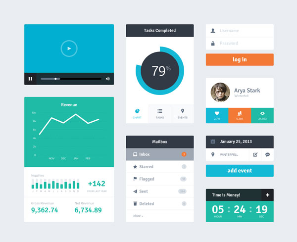
As 2015 focused more on delivering functionalities rather than the décor of the website. This is why Flat Designs became a trending design fashion as it gives a clean structure your mobile app. This further works as a major contributor in optimizing the user experience of your website which tends to increase the conversion.
3. Social Media Integration

Mobile apps of 2015 were dependent a lot on social networking sites such as Facebook, Google, Twitter and many more. Integration with social media has now become an indispensable part of mobile apps as it enhances the feature list of your mobile app. Further, it also works as a connecting tool with other audiences as your app users can ask their friends to try it or can throw a challenge on social media accounts. It is also another important tool for marketing as the users do not have to first open up the browser and a particular social media account for sharing the app as they can do it by simultaneously using the app.
4. Login via Social Media Accounts
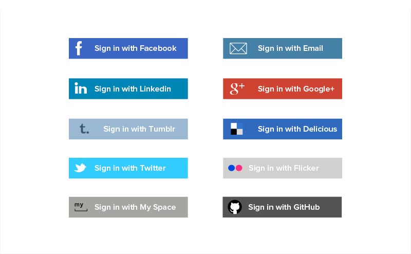
Most of the apps think that adding a big login form will be cool , however they fail to realize that users get pissed off when they see a big monotonous form. Therefore, many users uninstall the app even after downloading it. In order to remove this login form you can simply go for login via social media accounts. This will not only help the audiences save their time and will also avoid confusions as they won’t have to remember the login details specifically of their mobile app account.
5. Clean content using spaces
As all the design trends of 2015 focused on delivering a clear and simple appearance of the screen. This was also applicable on the content as well as Mobile app designers focused on delivering simple content by using space in order to separate widget or elements. This increased the readability of the content and thus made the app very easy to use,
6. Choose Sober and Simple Color Schemes
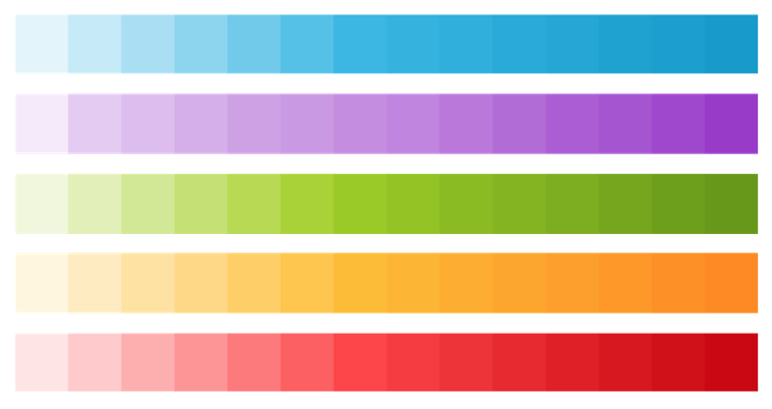
Usage of a lot of colors and very showy ones also makes the audience go away. Thus, if you don’t want your users to abandon your app after looking at the eye piercing colors, you need to choose a simple color scheme. Simple colors also optimize the “Flat ” design trend and makes it very soothing for the users to work on your mobile app.
7. Make use of Swipe Gesture Feature
Smartphones now make a lot of use of biometrics and other gestures such as swiping for adding functionalities and making mobile app execution a very easy task. Developer can ingeniously make use of these gestures to make navigation from one menu to another very easy and can further make use of it for other actions such as sharing or deleting.
8. Design after knowing about your audience

Designing an apps functionalities while keep the target users in mind will help you in achieving your target goals. In order to make them download your app you need to provide them what they need and what all they can plausibly like . If you are designing for a particular age group you need to sure that the gestures you are using in your app is liked by users or not. Younger age group like swapping more wherein the adults or millennial s prefer simple functionalities. If you don’t want to users to get irritated and uninstall your app then make sure that you make it as they like.
9. Architect Thumb-Focused interactions
Nowadays, people hold the phone in one hand and use the thumb to interact with their mobile apps.
People use their mobile phones while walking , traveling , cooking and doing many other chores, thus it becomes important for you to provide them what’s demanded as they can not stop using mobile phones but will certainly stop the using your app. So, make sure that your app runs on single pinch gesture and multiple gestures when required. This will certainly add usability of your app and will increase the number of active app users.
10. Fill & Stroke Icons
Another major trend of 2015 was designing app with fill and stroke technique, as this made it very lucid for the users to figure out the distinguish between the inactive and active icons in th application. Wherefore, improved the user experience.
As we can see that all the trends in 2015 were primarily focused on providing a clear picture of the functionalities offered by the app. Everything which simplified the UX/UI design was well accepted by the industry and thus became a trend. So, try to unravel the simplicity and you will get to become a trend setter. For more updates and trends feel free to drop your queries!
Author:
This is a guest post by Amanda Cline. Amanda has been working as app developer with Xicom Technologies Ltd- mobile app design and development company offering a range of software solutions like IT Outsourcing Services, Custom Software Development and Web and Mobile Application Development Services. Apart from this she has gathered an excellent amount of expertise as an IT support personal, blogger, computer programmer, App developer, a mentor and a trainer. You can Contact her Via @amandacline111
Hello.
Thank you for good tips.
But there is some tips. Flat Interface design and Stroke icons are just a fashionable and it will expire as soon as Microsoft or Google or Apple decide it. Keep your mind open and free from this bounds!
Some of principles in Layered Interface design is essential for design but it is bounded as a fashionable.
Hey, I think your ite might be having browser compatibility issues.
When I look at your blog in Safari, it looks fine but when openjng in Intternet Explorer, it has some overlapping.
I just wanted to give you a quick heads up!
Other then that, great blog!
Great Blog! Thanks for sharing this with lot of tips on mobile design trends. It will be helpful for everyone including beginners and learners.